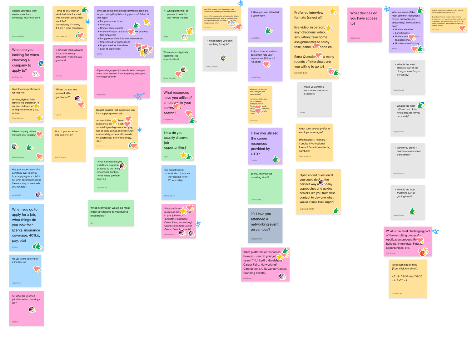
A look behind the scenes of our research, classroom collaboration, FigJam survey selection, and slide decks that shaped our insights.
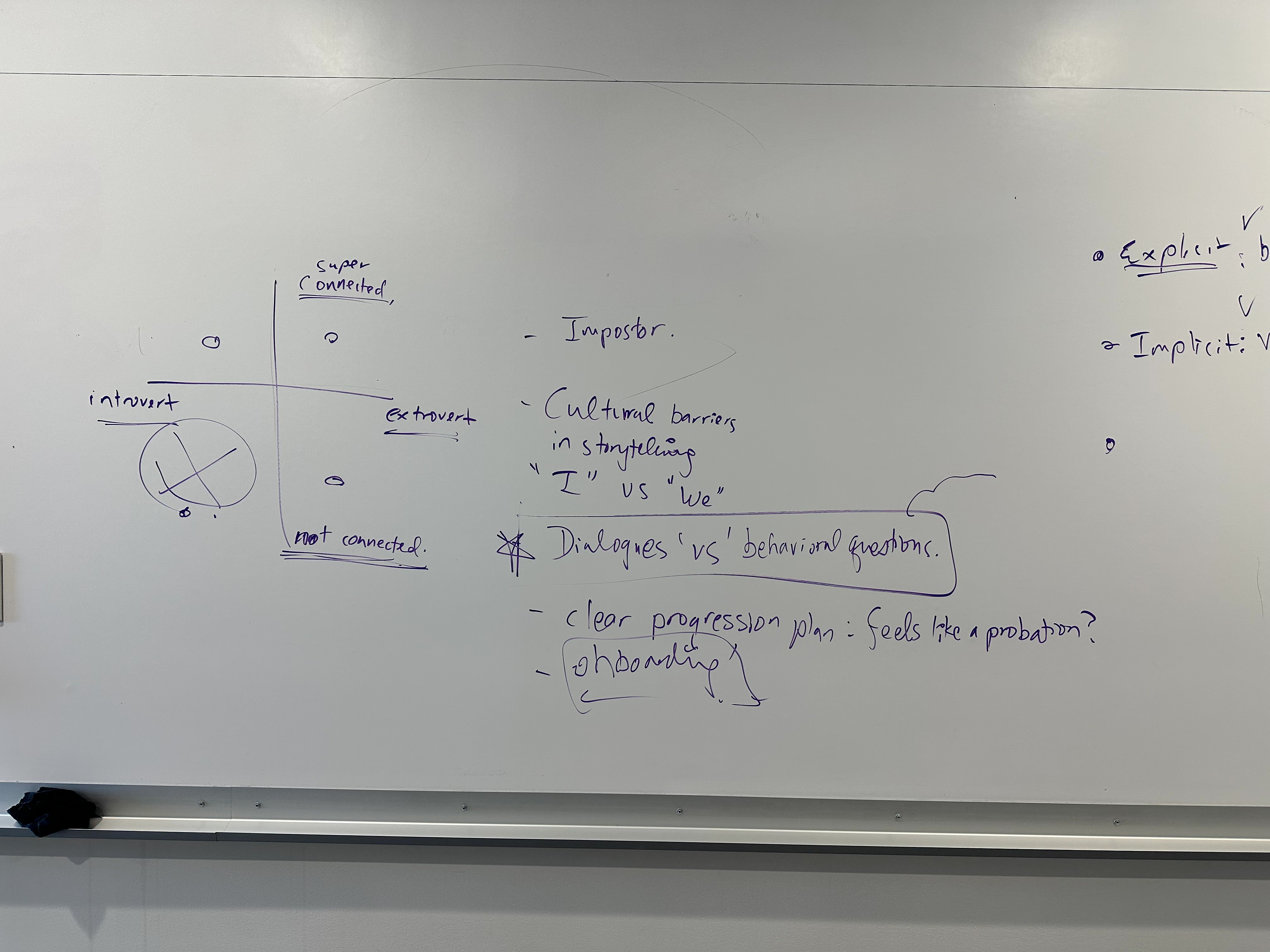
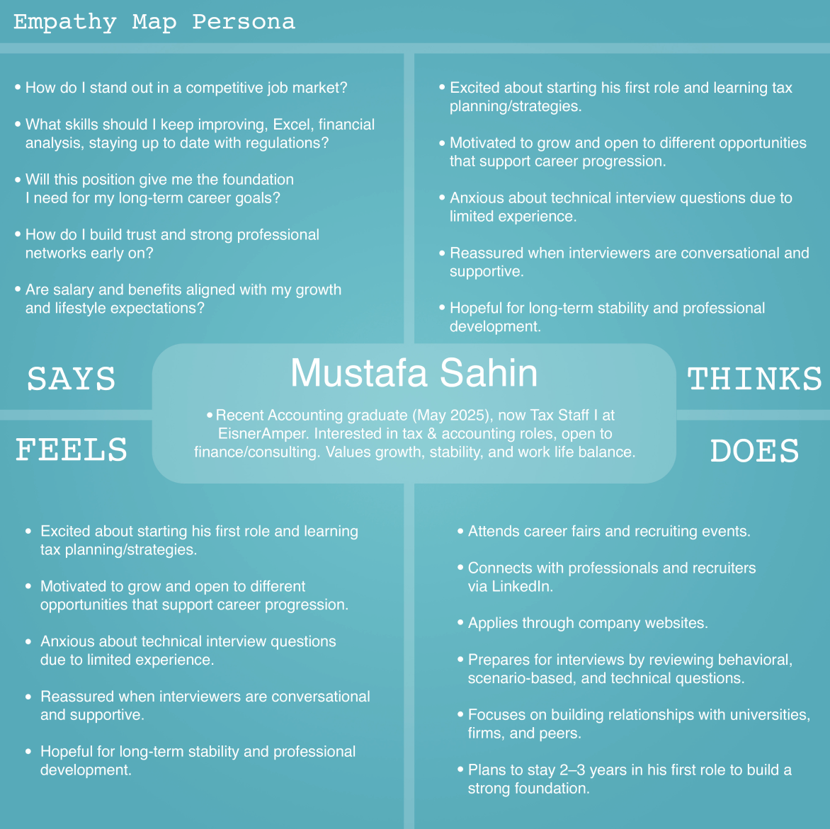
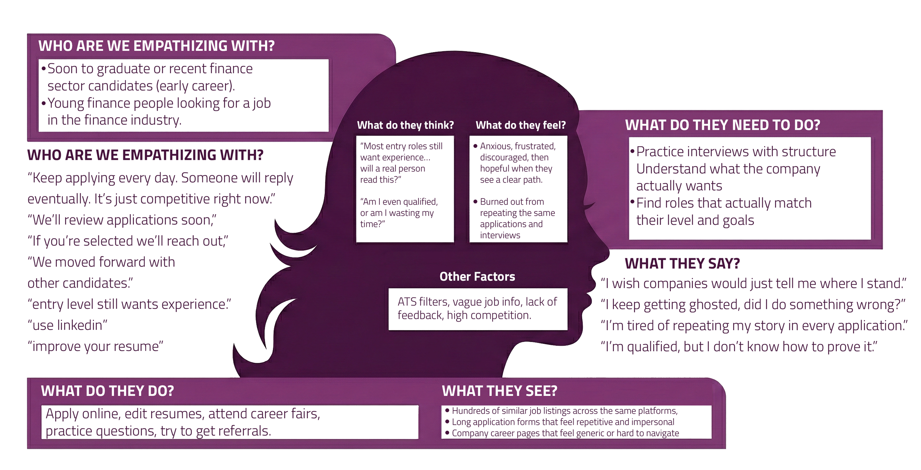
An empathy map helped us summarize what candidates experience during hiring, what they see, hear, think, feel, say, and do. We used it to keep our design focused on real pain points and guide Preface’s features toward clearer preparation, proof, and communication.
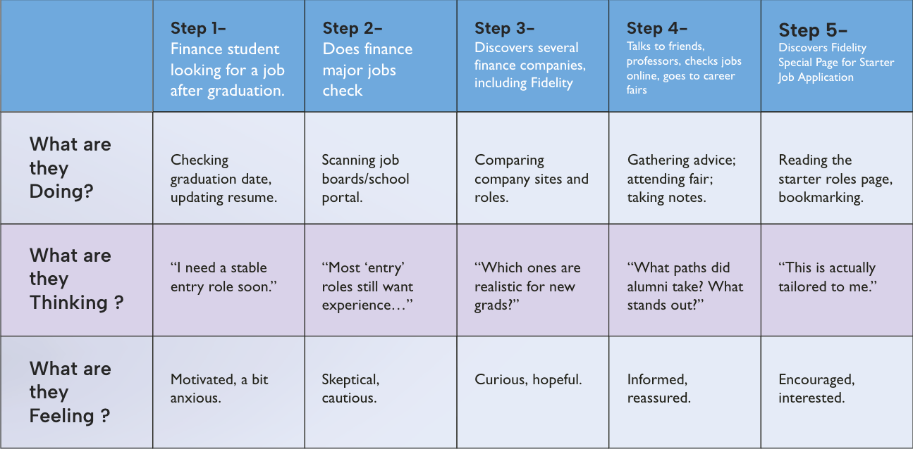
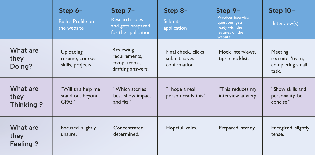
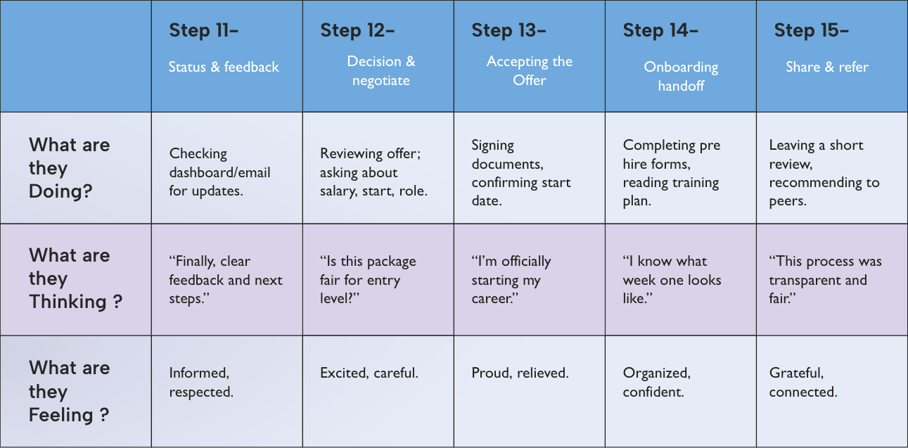
The User Journey Map
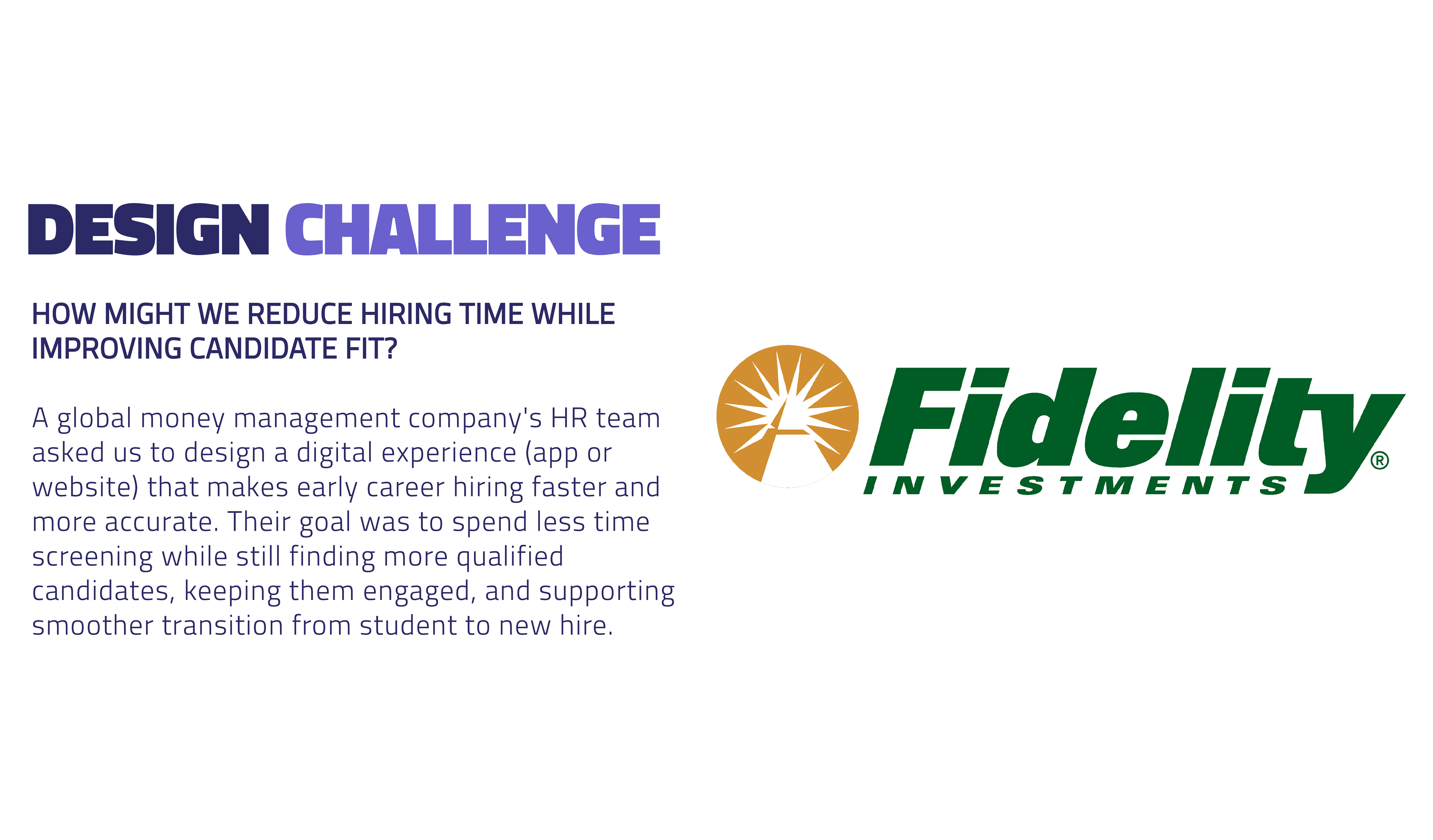
Problem Statement
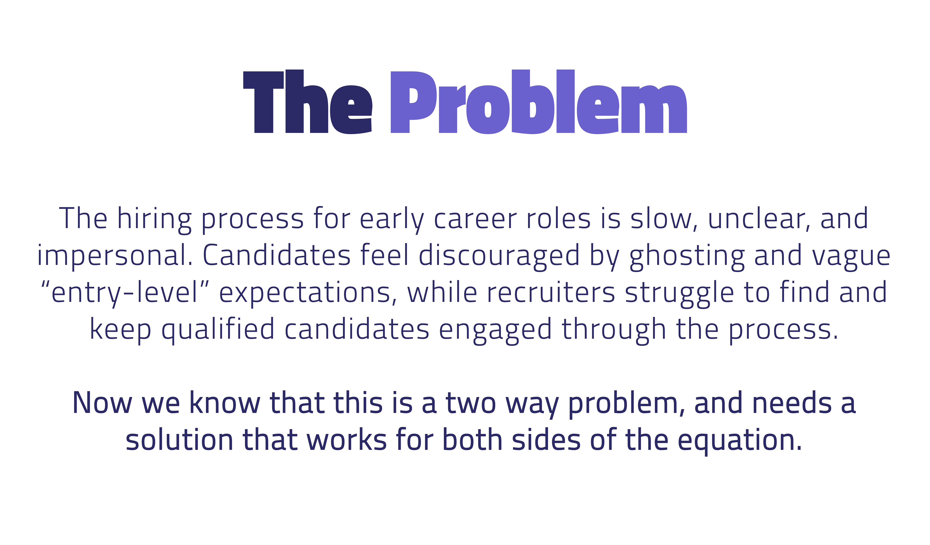
Recently graduated candidates need a clearer, more human, and more transparent path to prove readiness for finance roles because current hiring is often impersonal, vague, and slow, leading to candidate anxiety and disengagement, while recruiters still struggle to identify the best fit applicants efficiently.
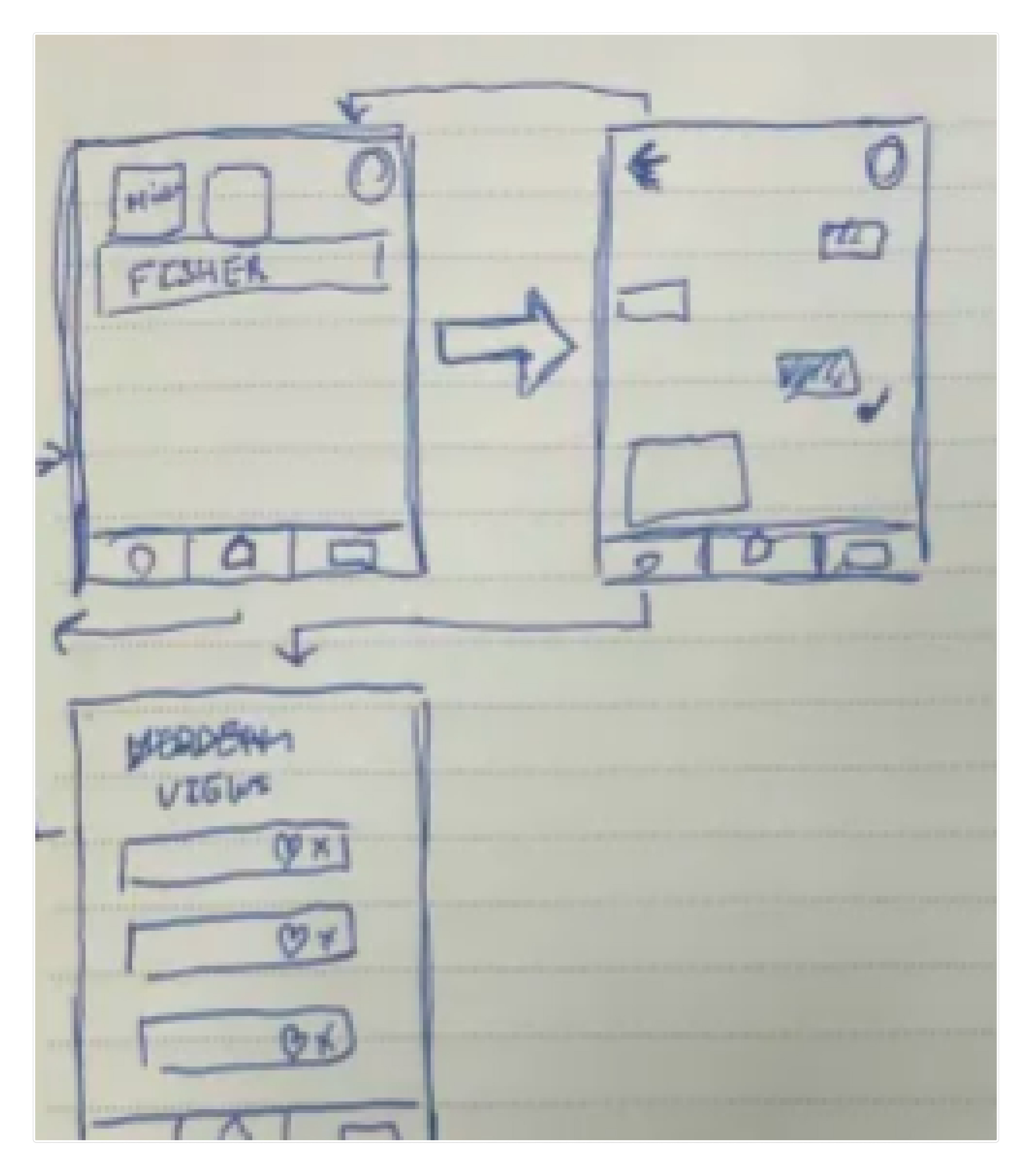
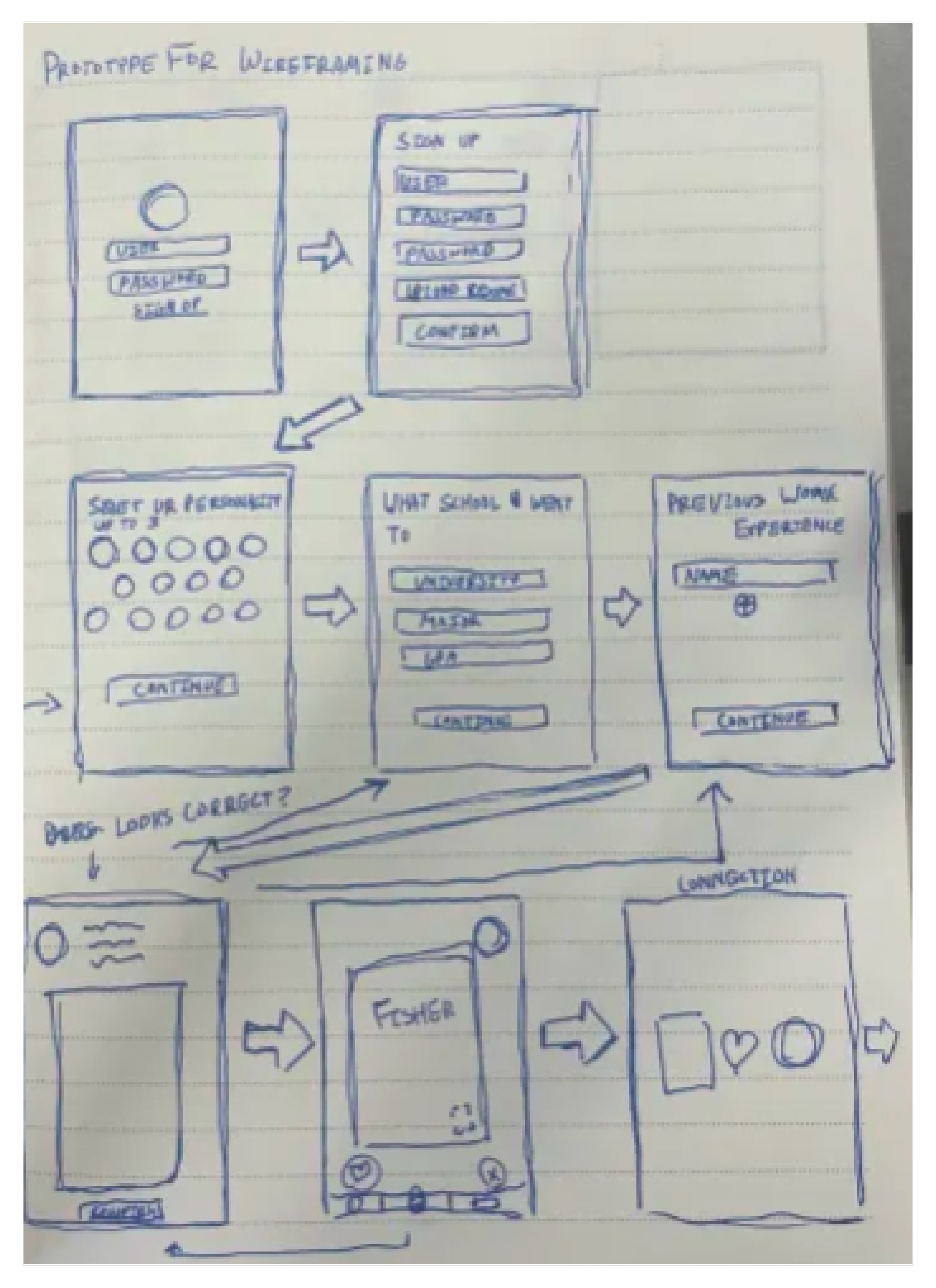
Our initial wireframes mapped the core Preface flow in a simple layout, helping us quickly test structure, navigation, and key features before investing time in high fidelity design.
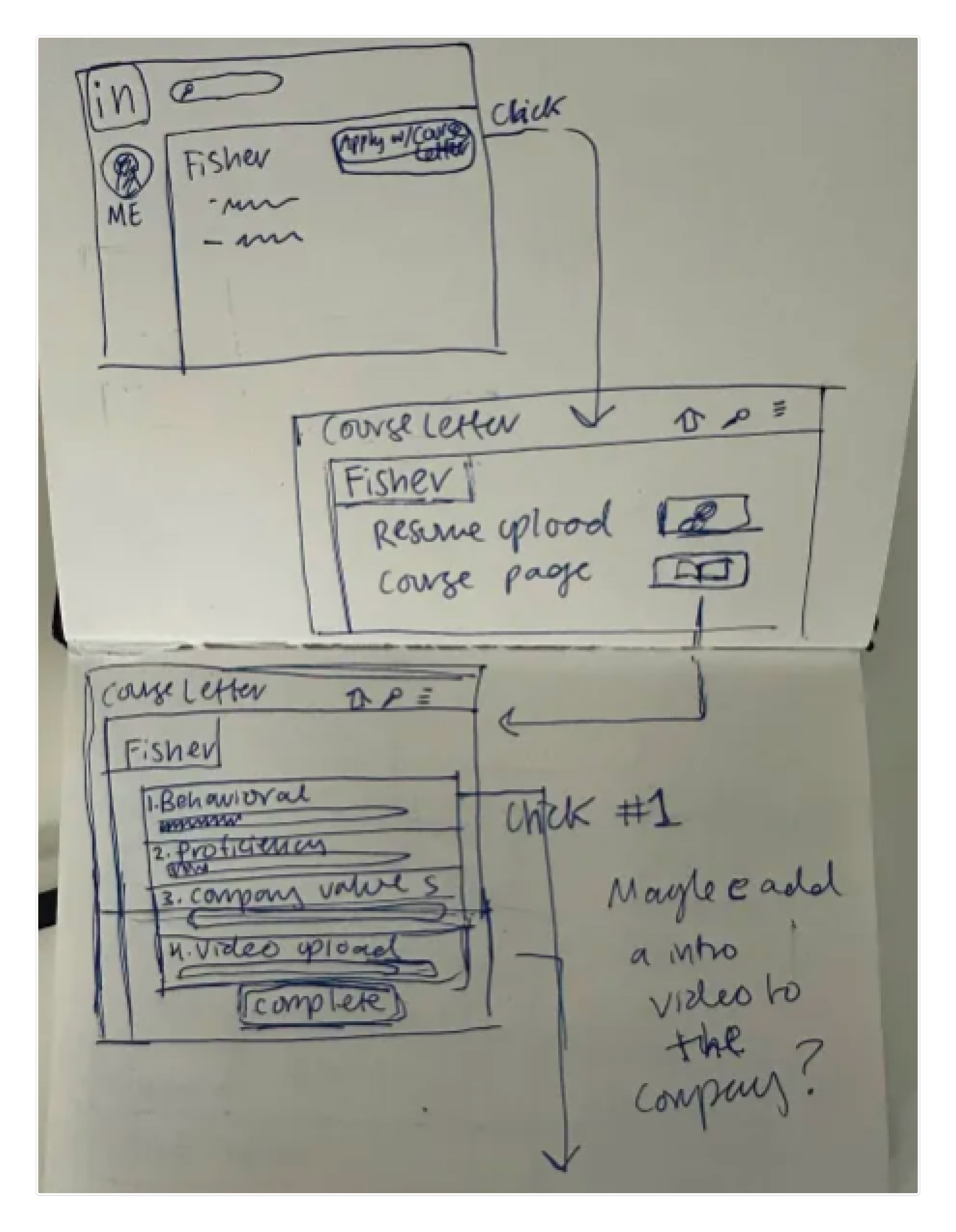
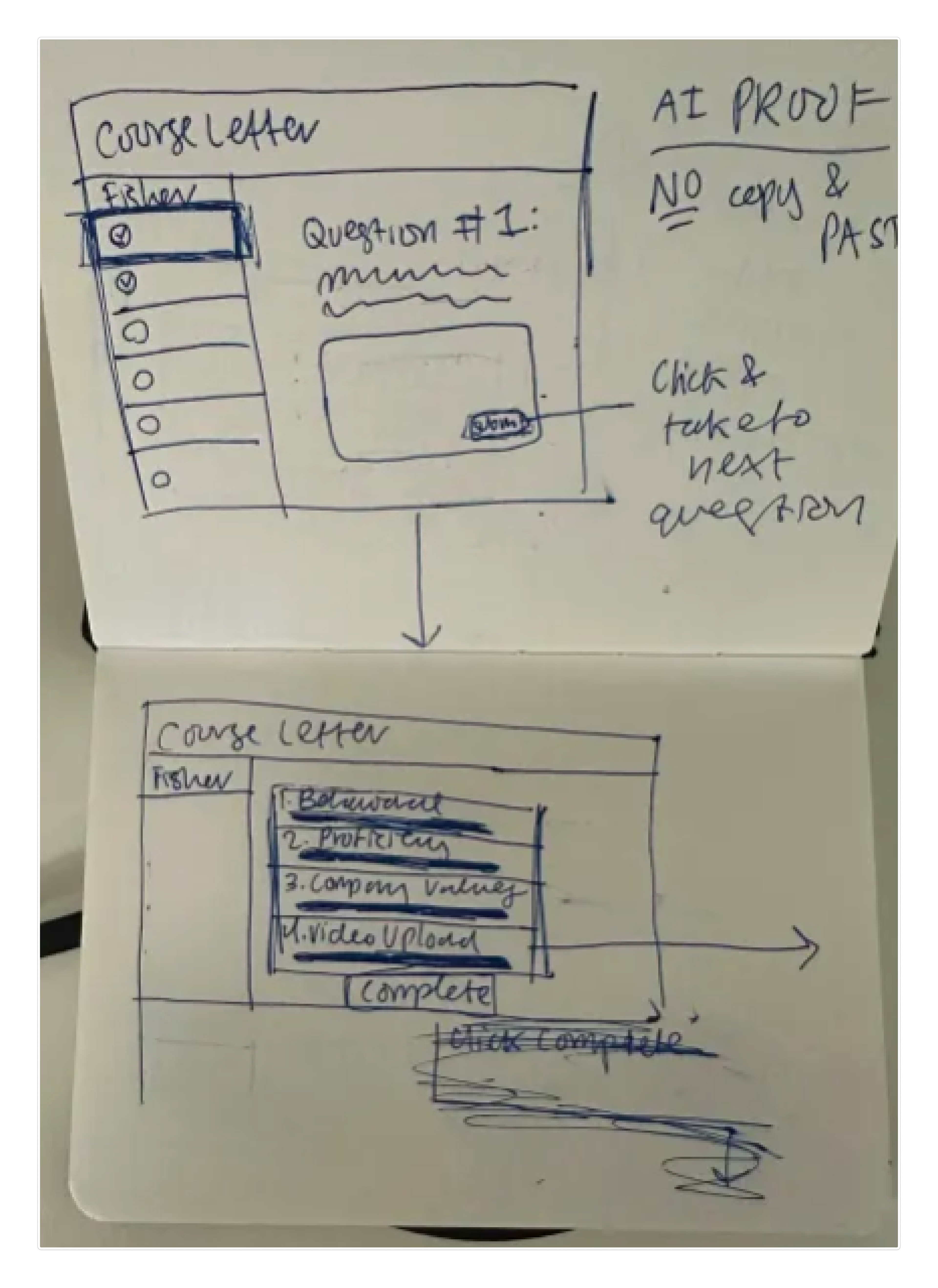
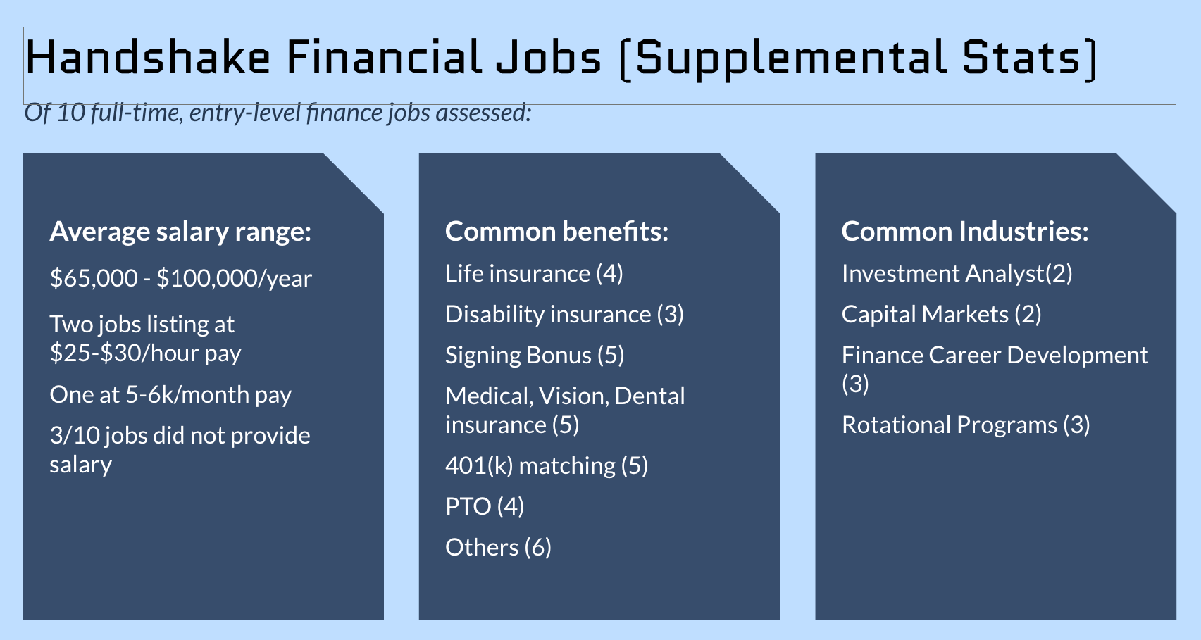
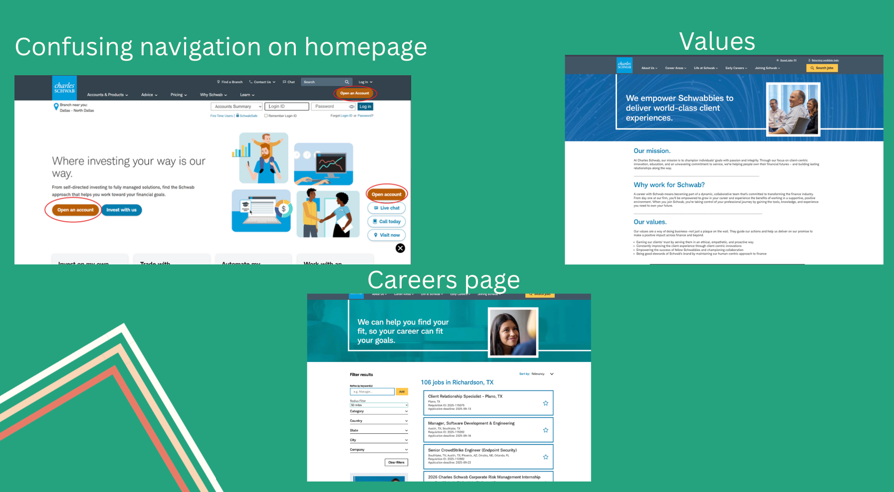
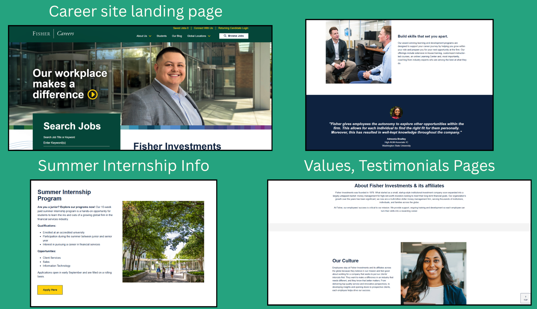
Our main focus was the content of the courses, and how they would aid both sides in making the job and candidate finding process the fastest and most reliable.
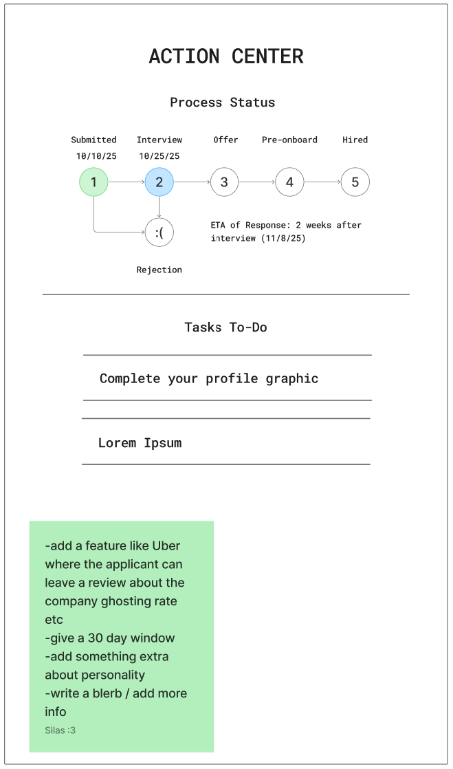
The Action Center
Cutting Features to Save HR Time
We explored an “Action Center” dashboard to track application status and add extra feedback features, but we removed it in later iterations. After reviewing the HR workflow, we realized it added complexity and would require extra effort from recruiters, going against our main goal of saving this company's time, so we focused on simpler, high-impact features that keep the process fast and easy to manage.
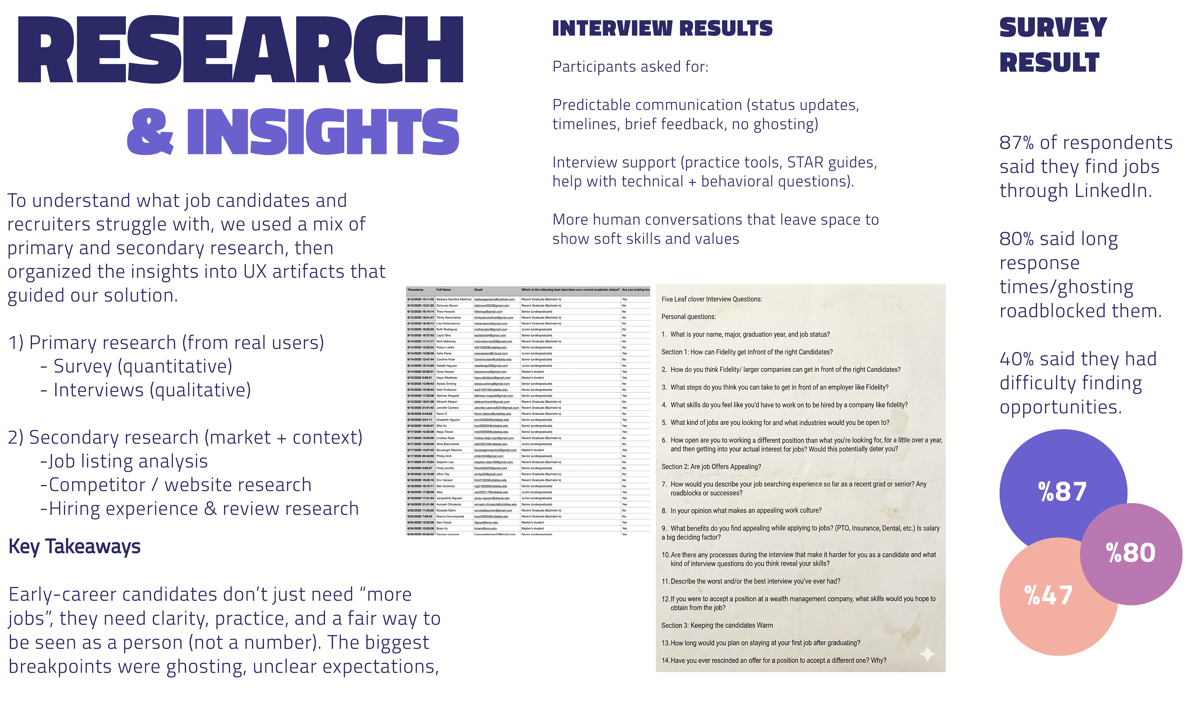
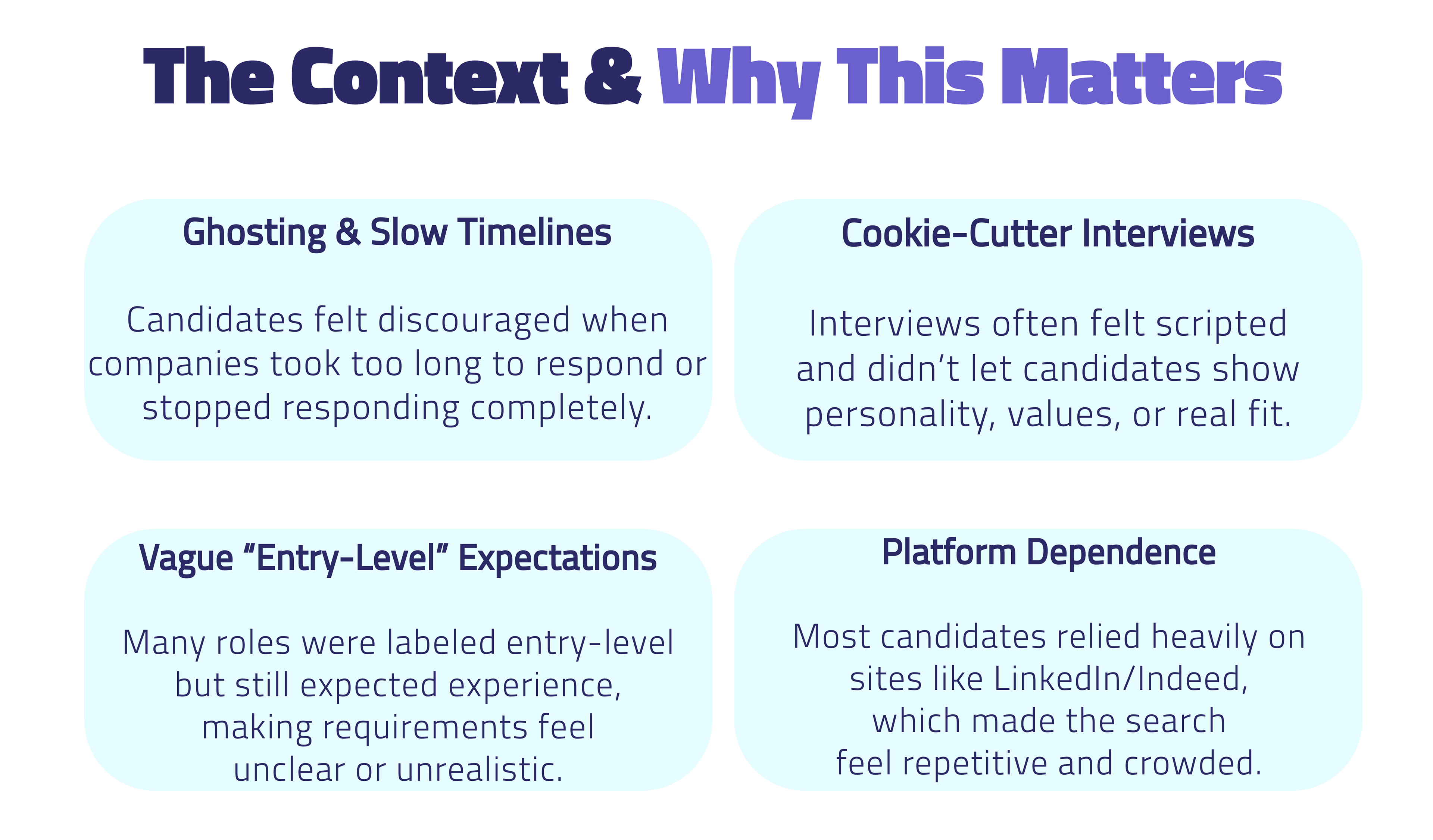
We iterated toward the most impactful features by focusing on what candidates said blocked them most:
Unclear expectations, lack of human connection, and unpredictable communication. That led us to prioritize tools for interview prep, clearer role information, and a more transparent process that helps candidates show both technical ability and soft skills.
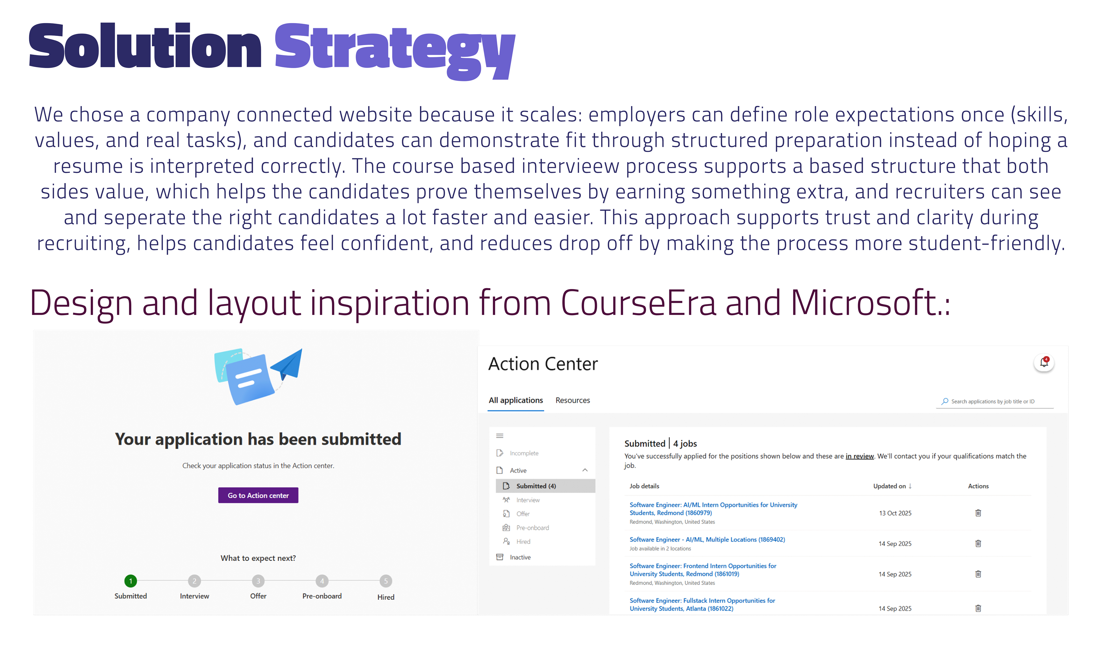
For Preface’s brand identity, we aimed for a look that feels credible enough for finance but still welcoming for users. During high-fidelity design, we built a mood board of real UI references (course platforms, LinkedIn style credibility cues, and well known finance brands) and used that to guide a clean, structured layout: clear page hierarchy, lots of spacing, and simple components that keep the experience easy to scan. The purple based palette and soft gradients helped us balance “professional” with “approachable,” so the product feels trustworthy without looking cold or corporate. The course and questions pages are mostly inspired by CourseEra's course pages and questions styles.
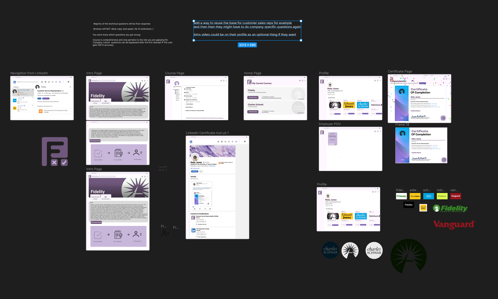
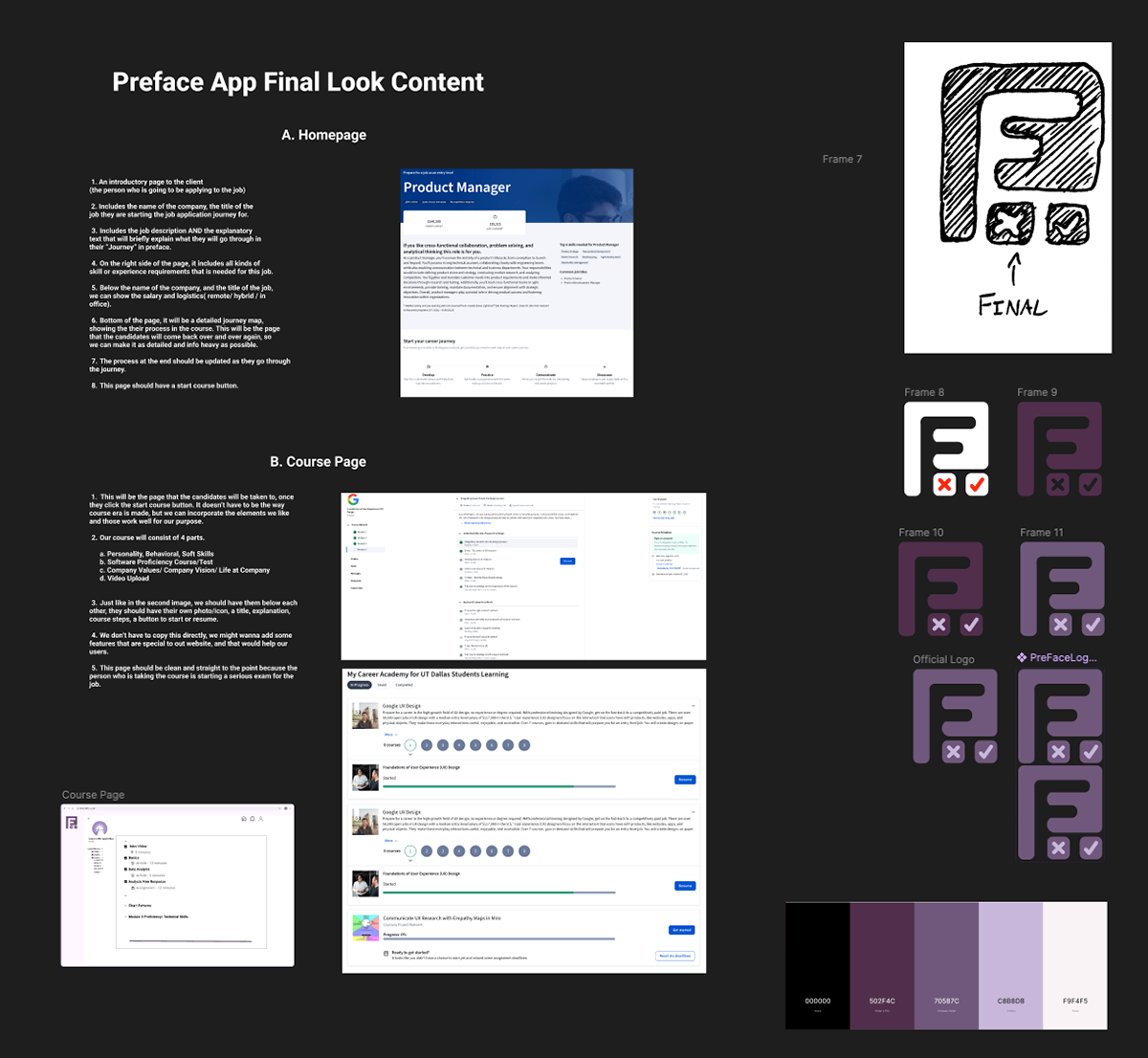
For the logo, we explored quick sketches and multiple digital variations before choosing a final mark that communicates what Preface stands for: preparation + proof + progress. The icon combines a bold initial with check / X elements to hint at learning, assessment, and completion, matching the core flow of taking a course, demonstrating proficiency, and earning a certificate. We refined the logo to work in different contexts (app icon, header, certificate, profile) and kept it minimal so it stays recognizable at small sizes while still fitting the overall “modern and clean” design language of the UI.
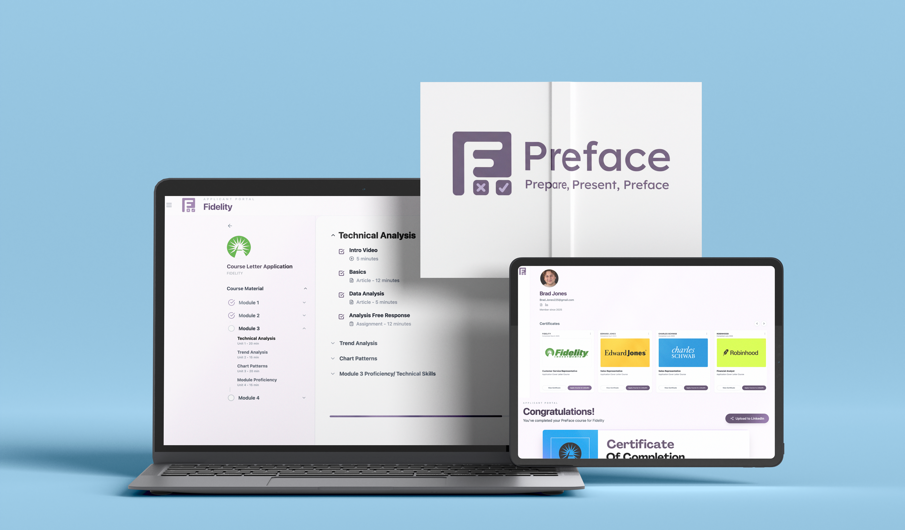
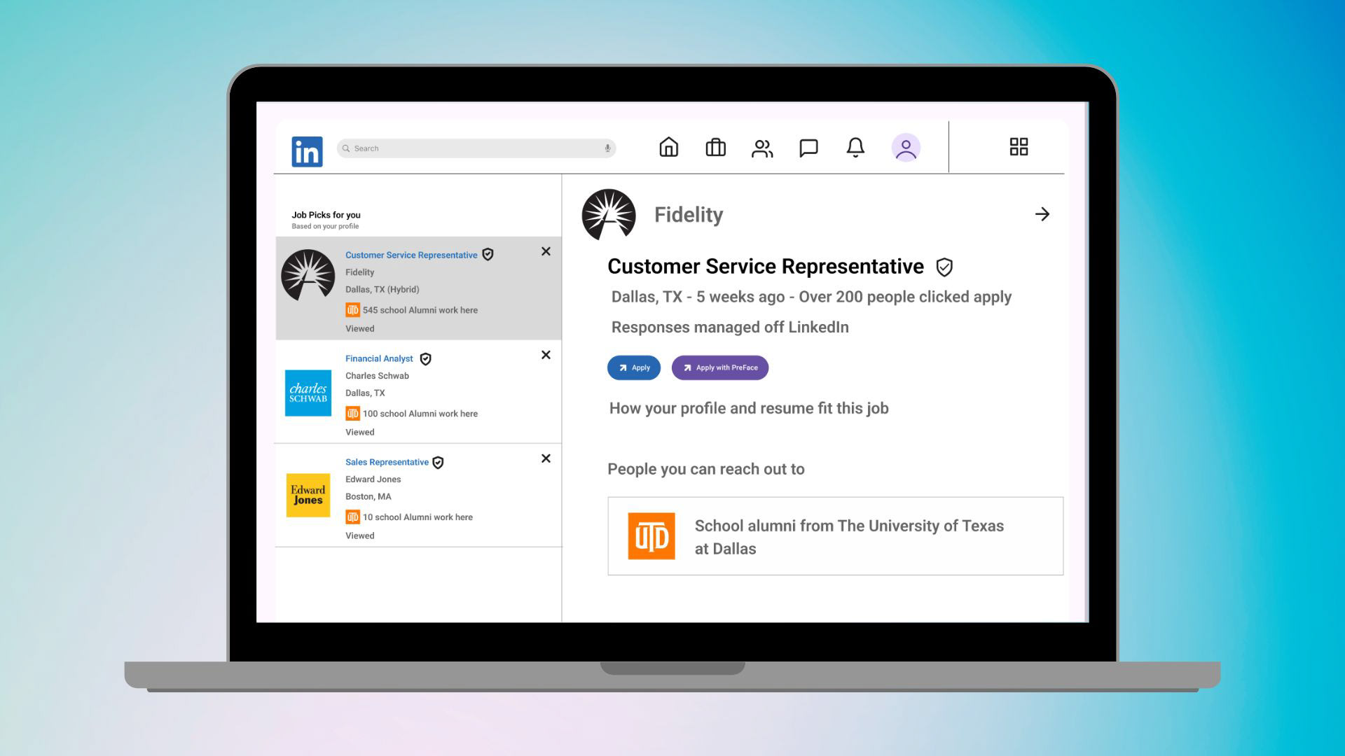
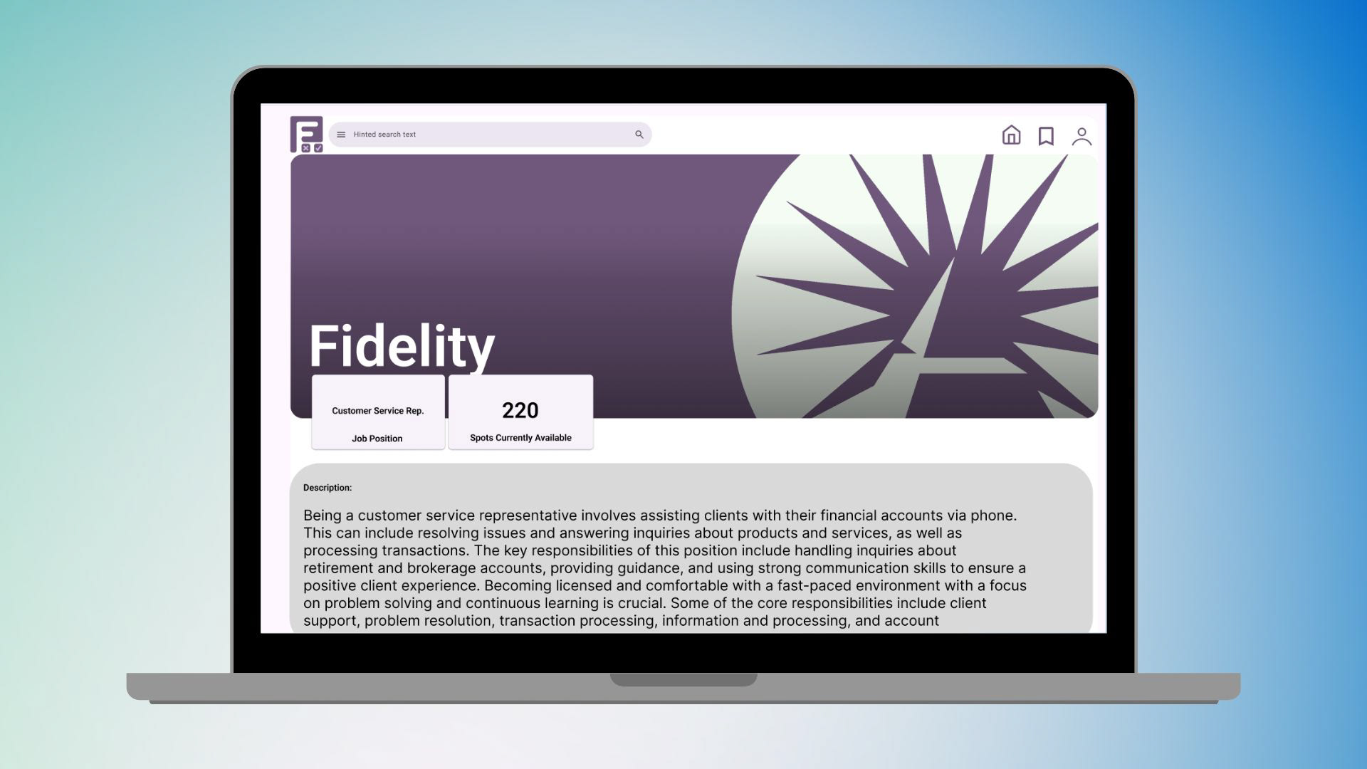
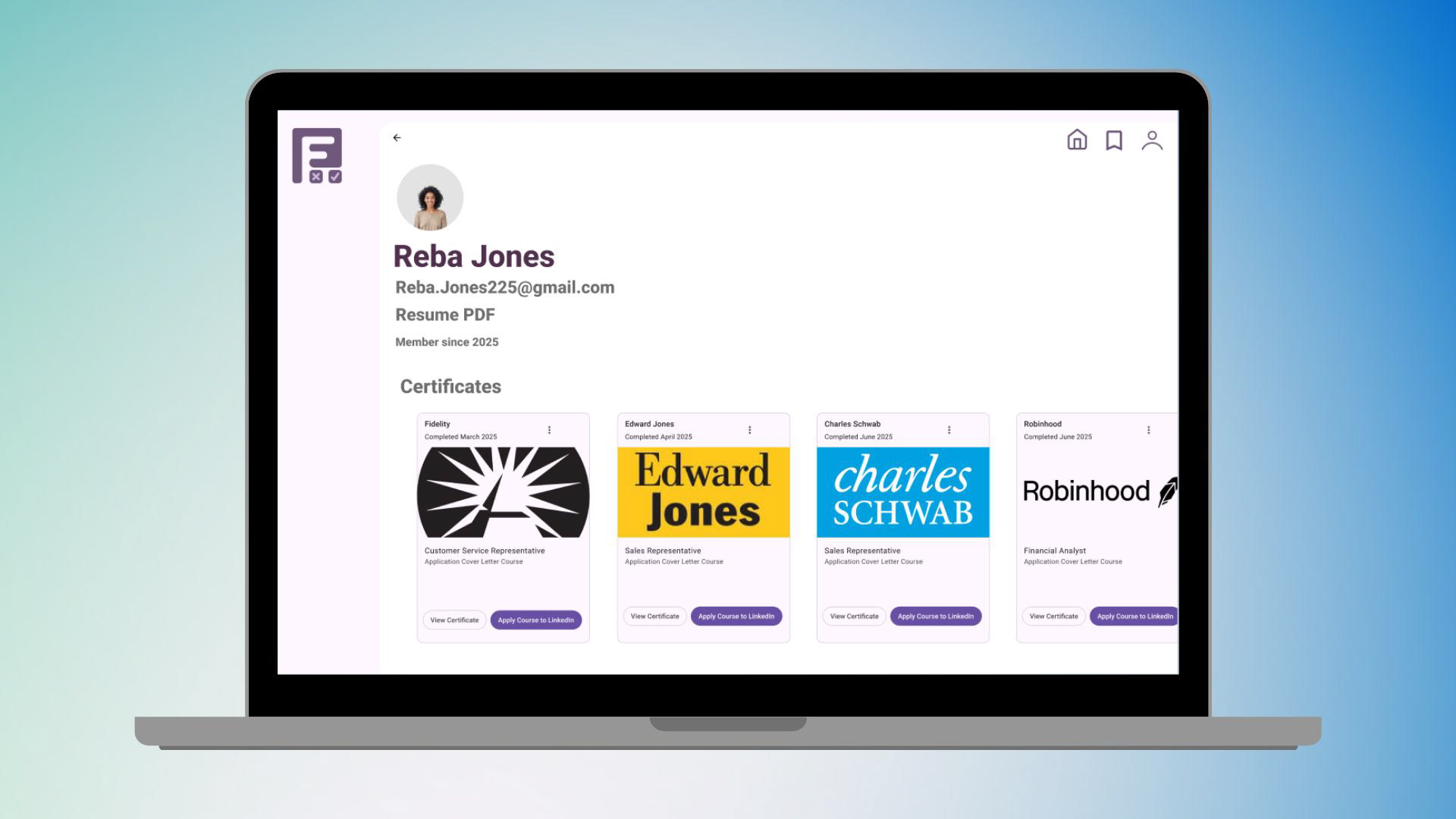
These high-fidelity screens show the full Preface flow from job discovery → skill proof → shareable results. We designed the experience to feel familiar and trustworthy by starting where many candidates already search (LinkedIn), then offering an “Apply with Preface” option that moves them into a clearer, guided path. Each company job page explains the role in plain language, highlights availability/expectations, and makes the next step obvious with a single call-to-action: Start Course Journey.
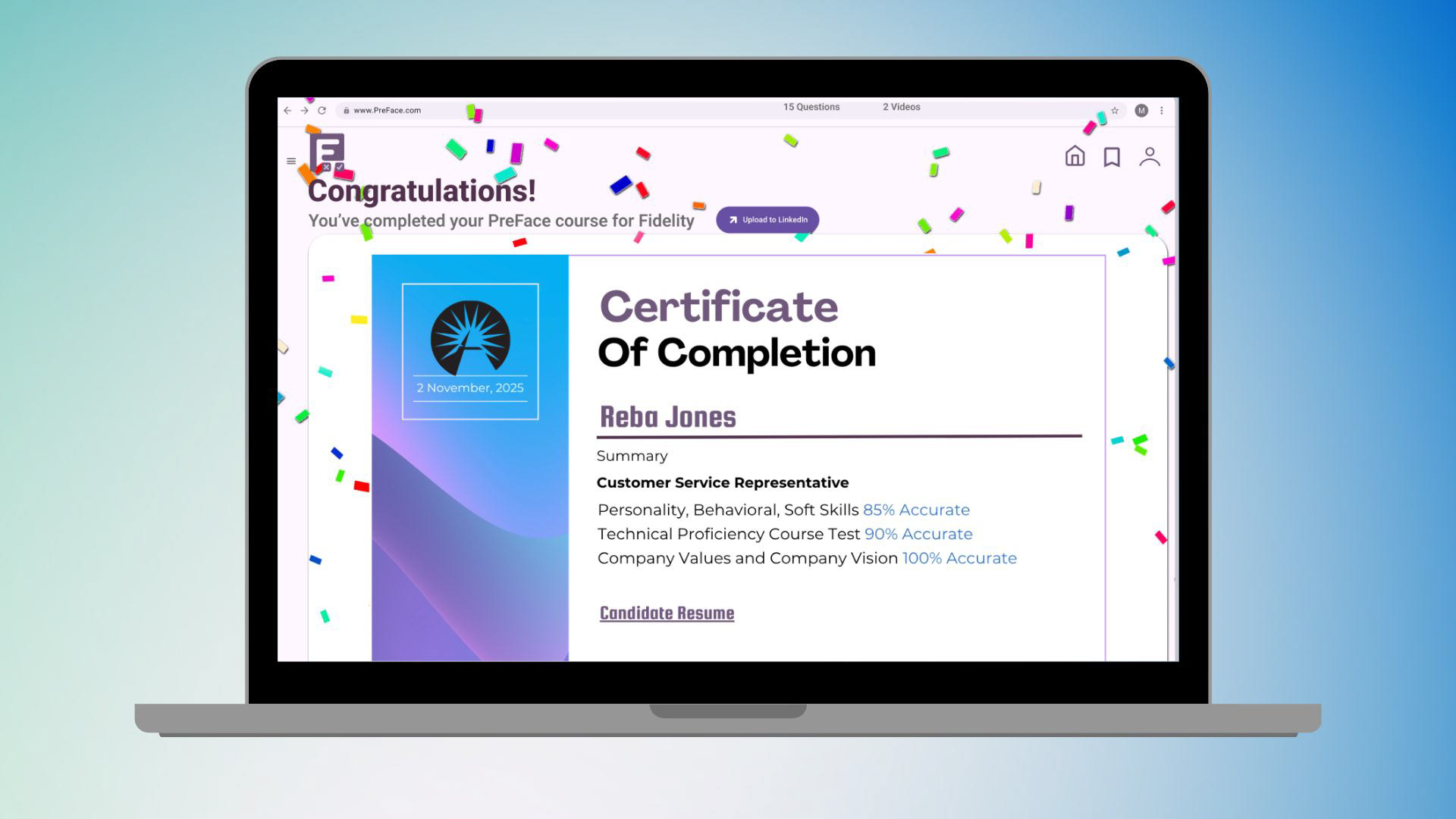
The final certificate screen is designed as a reward moment, clear proof of completion, key proficiency metrics, and a simple way to present results.
Check Out our Preface App Prototype Here!
Promotional Video for Preface

Hiring and finding a candidate is still slowed down by a process that’s vague, impersonal, and hard to evaluate, candidates get stuck in long waiting times and unclear expectations, while HR teams spend too much time screening without getting a confident read on real fit. Preface solves this by turning “potential” into proof: companies create role specific course paths working with Preface team, candidates complete them to demonstrate readiness, and recruiters receive a clear, skills based summary and certificate that makes decisions faster and fairer. By shifting recruiting from guessing to evidence, Preface builds trust on both sides, keeps strong candidates engaged, and helps teams hire with clarity instead of chaos. It’s a scalable, modern way to prepare, present, and preface the right people into the right roles, without wasting anyone’s time.
Team Members
Burak Bas - Researcher, Synthesizer, Filmmaking, Graphic Design
Rajit Goel - Wire framing, Prototyper, Coder
Silas Solomon - Project Manager, Designer, Event Planner
Tools Used in This Project
Pen and Paper
Canva
Figma
Figjam
Adobe Photoshop
Adobe Premiere Pro
Adobe Illustrator